


User experience (UX) focuses on having a deep understanding of users, what they need, what they value, their abilities, and also their limitations. It also takes into account the business goals and objectives of the group managing the project. UX best practices promote improving the quality of the user’s interaction with and perceptions of your product and any related services.
A great user experience on your site ensures that your visitors can find everything they’re looking for with ease and speed. It’s up to you to create a content-rich, meaningfully designed site that keeps your customers and partners engaged and returning for more.
There’s a lot to say about how to better UX in every aspect of an organization, but the quick tips below will help you avoid common UX mistakes on your website, and instead, create a site that’s easy to use and provides an engaging experience for the visitor.

Improve your navigation
Ask one of your non-designer friends what most irritates them about web sites and “not being able to find stuff” will be one of the first things they say. Yet testing out your web site’s navigation is one of the easiest things you can do. Prepare a stack of around 10-20 cards, where each card contains a short description of a likely goal that your system supports. For example, “Download a statement” might be common task for money management software. On the reverse of your card, list the main headings from your existing navigation structure. Give users the task cards and ask them to tick the heading they would use to get going with that task. This is called a tree test and it’s just one of many simple ways to find out how your users think.
Speed
Optimize images: Speed matters. Every fraction of a second a visitor waits for your site to load, their frustration grows—and that frustration is aimed at your brand. Images account for a significant portion of that load time. Make sure you’re not making your visitors download a gigantic image that’s only being used as a tiny thumbnail. A website set up properly on a CMS will do this automatically for you, but if that’s not the case, there are plenty of free tools available that you can use to optimize your images before adding them to the site (JPEGmini, Smush.it, etc.).
Automate speed improvements: Set up as many automated speed improvements as you can. If you use a CMS, install a plugin that will cache parts of your site so that visitors don’t need to download anything more than once. WP Super Cache or W3 Total Cache are great if you use WordPress. These plugins can also minify and compress files, making file sizes significantly smaller and allowing visitors to browse your site more quickly. Some of the more technical aspects of caching and compressing files may require a web development partner.
Choose Colors Deliberately
Colors are an important part in the visual appeal of your website and your overall user experience. Certain color combinations will draw in certain visitors. A survey by Kissmetrics revealed that blue was the favorite color among women, whereas the color orange was voted as their least favorite. This gives a deep insight into combining data analytics of your website visitors with color choices. Do your research, perform user tests, and user your findings to optimize conversions on your site. According to NeuroMarketing, “If a good color sells, the right color sells better.”
Implementing Responsive Web Design
RWD is a Web design approach aimed at crafting sites to provide an optimal viewing experience — easy reading and navigation with a minimum of resizing, panning and scrolling — across a wide range of devices (from desktop computer monitors to mobile phones).
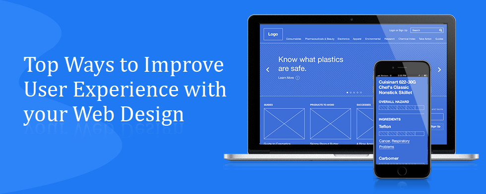
Choose Images Wisely
Humans are visual creatures, so images can make a huge difference in user experience. Adding industry-relevant images allows you to bring in an element of personalization and shape how visitors interact with your website. This is precisely what 37Signals did. They conducted an A/B testing between a white background and a background of one of their customers. This attempt at personalization through images yielded an increase in sign ups by 102.5 percent.
Avoiding Overwhelming Users With Data Entry
Inputting a bunch of crap into a thousand form fields before even using an app is awful. This is very common with business and enterprise software. We believe that business software doesn’t have to stick, so we use a “drip” methodology for data entry. We ask users to input 30 bits of data over 30 days, rather than inputting 30 bits of data right now over 30 minutes.
Review your mobile channel
Every year we’re told that “This will be the year for mobile”. If your mobile channel is simply your web site plus ‘pinch-to-zoom’ then this is a good place to start to improve the experience of your users. For your mobile channel, take the red routes you’ve identified and strip away everything else.
Add Definitive Calls-to-Action
Simply stating facts about your business and urging potential customers to make a purchase is a bad strategy. Instead, use a guiding hand to help visitors form a buying decision by highlighting a prominent call-to-action button. Making a notable call-to-action increases conversions significantly.
Evaluate your error messages
Nobody loves error messages. Users hate them because an error message implies they’ve done something stupid. Programmers hate them because they’re a diversion from coding. Designers hate them because they’re like epiphenomena, irrelevant to the main job of the user interface. That’s probably why the phrasing of error messages in many design teams seems as if it’s been relegated to an unpaid intern. You can do better. Review all of the error messages in your system and ask: Are they helpful? Constructive? Precise? Do they avoid blame? Your users may not love your error messages but this will help remove some of their pain.
Educating Consumers
The user experience itself is highly intuitive and the result of significant research and development in the early days. We now invest our time and efforts in consumer education and familiarizing users with a behavior that is still relatively new, and we are making some good traction here. We are also working on integrating our app more seamlessly with social media.
____________________________________________________________________________________________
We provide the best quality backlinks as ever, pls contact us qualitybacklink.net@gmail.com ; Skype: qualitybacklink